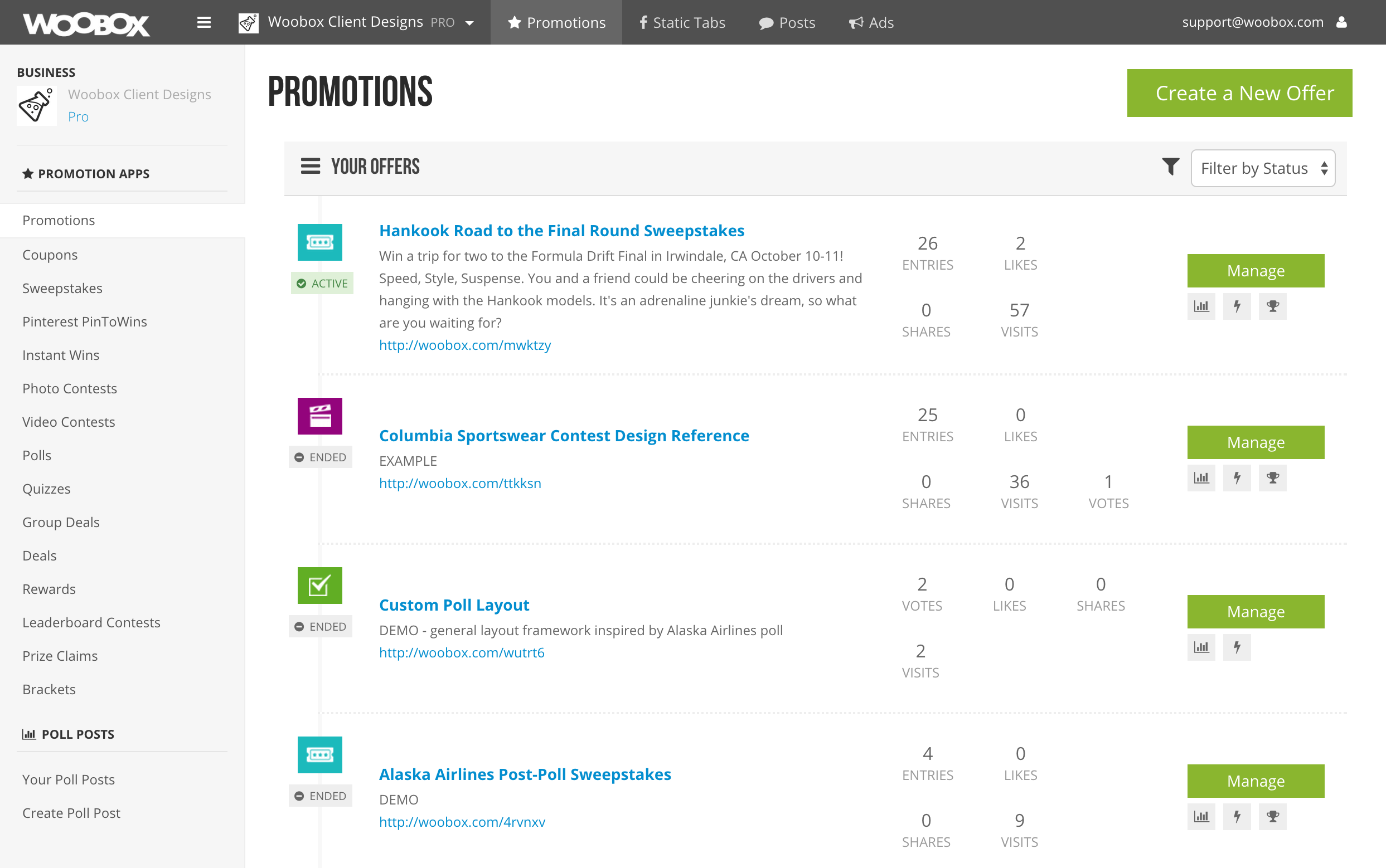
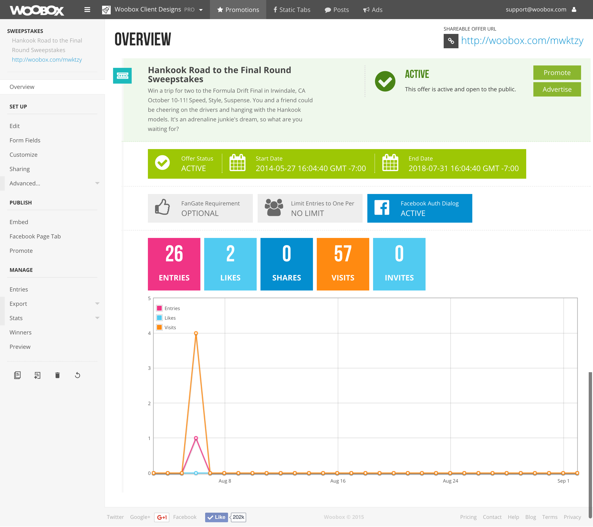
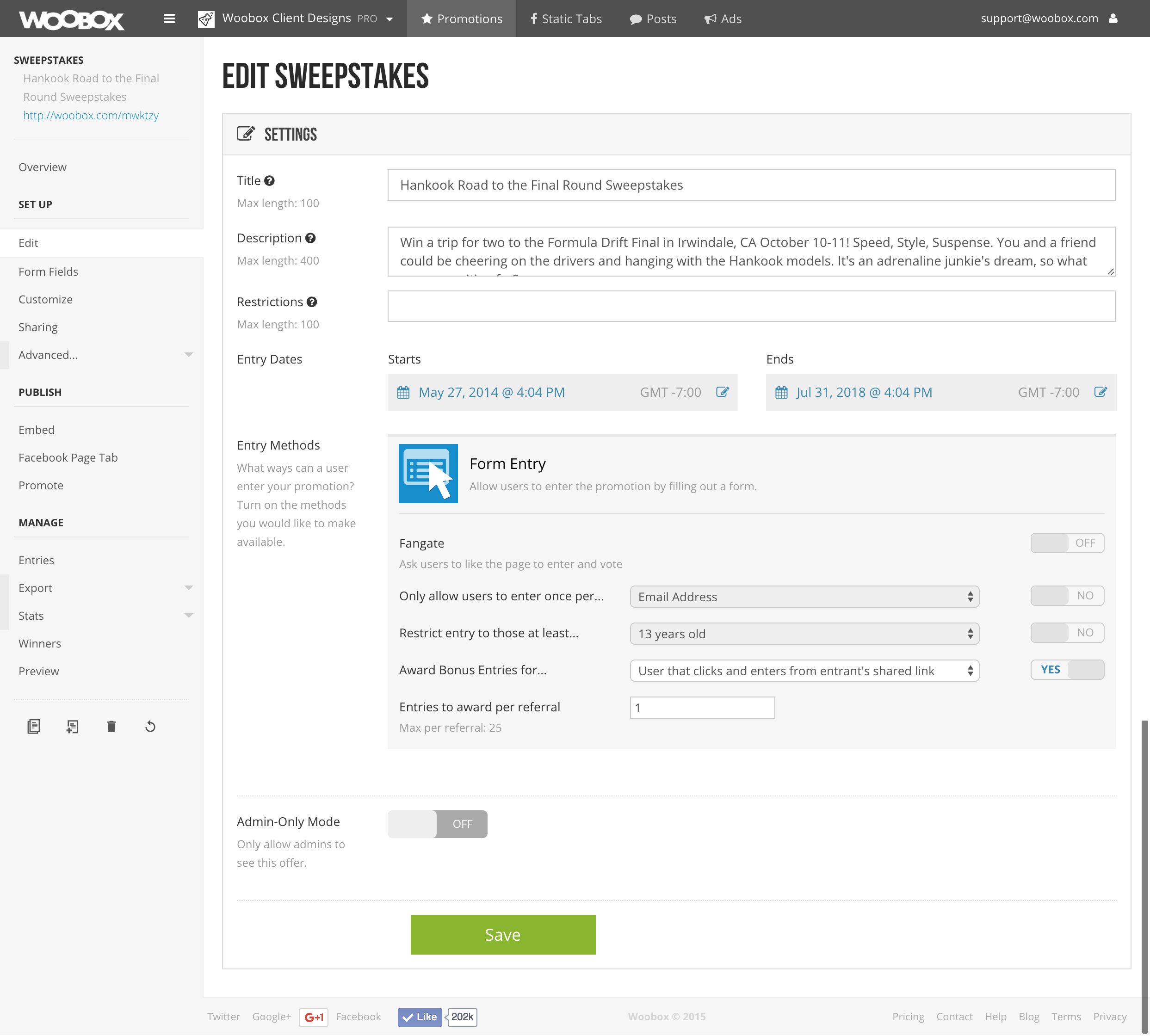
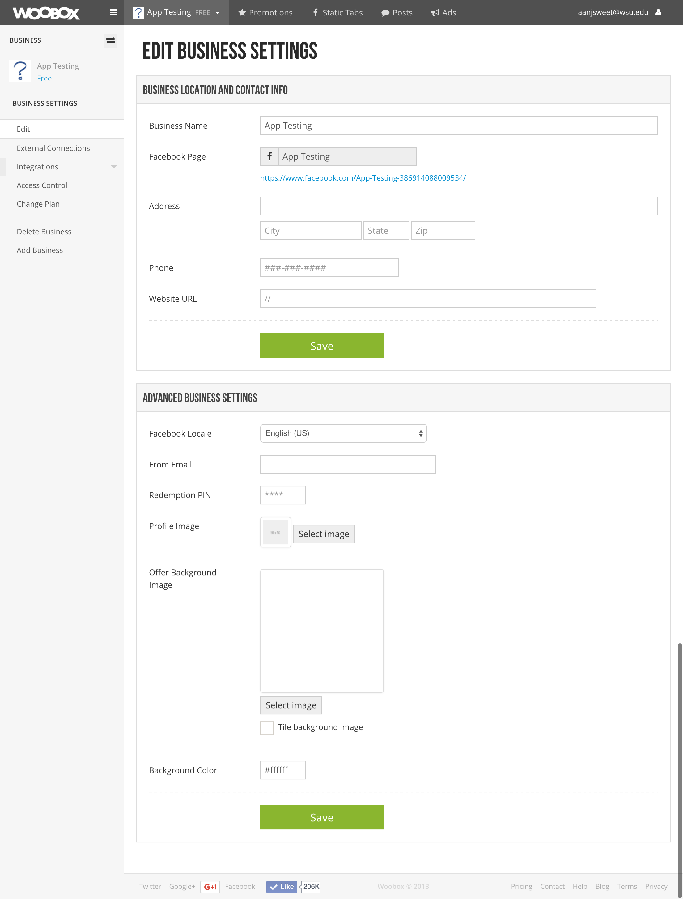
Complete Redesign & Development of Woobox User Dashboard
In about October 2013, my boss approached me with an idea that I'd been pushing for for quite some time... A complete redesign of the user-facing dashboard in our SaaS product. At this point, I did not know a thing about UI or UX design, and it was a long and laborious process getting myself to a point where I felt comfortable with it. This ultimately resulted in my creating a complete, working HTML mockup of the dashboard (which was sort of sliced and diced before it got to the final product, but the essence was still there).
My wish would have been to do quite a bit of restructuring within the dashboard and the general user experience/flow, based on a lot of feedback I'd received or seen while working with customers through our support channels. However, the end product turned into more of a re-skinning of the dashboard, as opposed to a reconstruction of the whole thing, due to complications that may have been caused in the backend with the latter.


